[React] 별점 기능 구현
별점 기능에 대해 참고할만한 글이나 영상들을 찾아보다가
리액트로 별 반개 씩 별점을 주는 기능은 별로 없어서 써본다.
import { useState } from "react";
import StarInput from "./StarInput";

const StarRating = () => {
  const [rating, setRating] = useState(0);

  const handleClickRating = (value) => {
    setRating(value);
  };

  return (
    <section>
      <h1>별점</h1>
      <fieldset>
         <StarInput
          onClickRating={handleClickRating}
          value={5}
          isHalf={false}
        />
        // 생략
        <StarInput
          onClickRating={handleClickRating}
          value={0.5}
          isHalf={true}
        />
      </fieldset>
      <span>{rating}</span>
    </section>
  );
};

export default StarRating;
대략 전체적인 구조로 useState를 사용하여 rating이란 이름으로 상태를 관리하였고
라디오 인풋으로 5점부터 ~ 0.5점까지 0.5 단위 씩 별점을 value 값으로 주어 StarInput 컴포넌트를 만들었다.
isHalf props은 별점이 지금 0.5 단위인지 진리값으로 주었다. 값이 true이면 별의 반개인 아이콘이 나타난다.
import { FaStar, FaStarHalf } from "react-icons/fa";

const StarInput = ({ onClickRating, value, isHalf }) => {
  const handleClickRatingInput = (value) => {
    onClickRating(value);
  };

  return (
    <>
      <input type="radio" name="rating" id={`star${value}`} value={value} />
      <label
        onClick={handleClickRatingInput}
        isHalf={isHalf}
        htmlFor={`star${value}`}
      >
        {isHalf ? <FaStarHalf /> : <FaStar />}
      </label>
    </>
  );
};

export default StarInput;
css로 스타일을 어떻게 구현해야할지 가장 고민이었다.
지금은 별 반별 별 반별 별 반별 별 반별 별 반별 이렇게 나열되고 있지만
(반별 별) (반별 별) (반별 별) (반별 별) (반별 별)과 같이 요소가 겹쳐지게 해야했다.
이에 대해 바닐라 자바스크립트로는 fontawesome으로 ::after 요소에 반개의 별 아이콘 유니코드를 넣어 position: absolute로 위치를 잡아서 구현한 경우도 많이 보였다. 하지만 한 번 시도해보았으나 지원 하지 않는 건지 되지 않았고 원하는 아이콘이 아니었기 때문에 이 방법으로는 사용하지 않았다.
생각을 여러 번 해도 좋은 해결책이 나오지 않아서 어쩔 수 없이 transform을 이용하여 조정을 하였다.
half의 상태가 true인 컴포넌트에 position: absolute와 transform을 이용해 width에 맞게 조정을 했다.
전체코드
import styled from "@emotion/styled";
import { useState } from "react";
import StarInput from "./StarInput";

const Base = styled.section`
  display: flex;
  align-items: center;
  gap: 8px;
`;

const Name = styled.span`
  font-size: 1.4rem;
  line-height: 100%;
`;

const RatingValue = styled.span`
  font-size: 1.2rem;
  line-height: 100%;
`;

const RatingField = styled.fieldset`
  position: relative;
  display: flex;
  align-items: center;
  flex-direction: row-reverse;
  border: none;
  transform: translateY(2px);

  input:checked ~ label,
  labeL:hover,
  labeL:hover ~ label {
    transition: 0.2s;
    color: orange;
  }
`;

const StarRating = () => {
  const [rating, setRating] = useState(0);

  const handleClickRating = (value) => {
    setRating(value);
  };

  return (
    <Base>
      <Name>별점</Name>
      <RatingField>
        <StarInput
          onClickRating={handleClickRating}
          value={5}
          isHalf={false}
        />
        <StarInput
          onClickRating={handleClickRating}
          value={4.5}
          isHalf={true}
        />
        <StarInput
          onClickRating={handleClickRating}
          value={4}
          isHalf={false}
        />
        <StarInput
          onClickRating={handleClickRating}
          value={3.5}
          isHalf={true}
        />
        <StarInput
          onClickRating={handleClickRating}
          value={3}
          isHalf={false}
        />
        <StarInput
          onClickRating={handleClickRating}
          value={2.5}
          isHalf={true}
        />
        <StarInput
          onClickRating={handleClickRating}
          value={2}
          isHalf={false}
        />
        <StarInput
          onClickRating={handleClickRating}
          value={1.5}
          isHalf={true}
        />
        <StarInput
          onClickRating={handleClickRating}
          value={1}
          isHalf={false}
        />
        <StarInput
          onClickRating={handleClickRating}
          value={0.5}
          isHalf={true}
        />
      </RatingField>
      <RatingValue>{rating}</RatingValue>
    </Base>
  );
};

export default StarRating;
import styled from "@emotion/styled";
import { css } from "@emotion/react";
import { FaStar, FaStarHalf } from "react-icons/fa";
const Input = styled.input`
display: none;
`;
const Label = styled.label`
cursor: pointer;
font-size: 1.5rem;
color: lightgray;
${({ isHalf }) =>
isHalf &&
css`
position: absolute;
width: 12px;
overflow: hidden;
&:nth-of-type(10) {
transform: translate(-108px);
}
&:nth-of-type(8) {
transform: translate(-84px);
}
&:nth-of-type(6) {
transform: translate(-60px);
}
&:nth-of-type(4) {
transform: translate(-36px);
}
&:nth-of-type(2) {
transform: translate(-12px);
}
`}
`;
const StarInput = ({ onClickRating, value, isHalf }) => {
const handleClickRatingInput = (value) => {
onClickRating(value);
};
return (
<>
<Input type="radio" name="rating" id={`star${value}`} value={value} />
<Label
onClick={handleClickRatingInput}
isHalf={isHalf}
htmlFor={`star${value}`}
>
{isHalf ? <FaStarHalf /> : <FaStar />}
</Label>
</>
);
};
export default StarInput;
StarInput 컴포넌트에서 별점을 5부터 시작하는 이유가 있다.
별에 마우스를 대거나 클릭을 할 경우, 만약 3점을 클릭하면 나머지 0.5~2.5 선택이 모두 되어야 한다.
~ 선택자는 요소의 다음 형제 요소들을 선택하기 때문에 순서를 반대로 하였다.
그리고 flex-direction:row-reverse;로 모습이 반대로 바뀌게 하였다.
const RatingField = styled.fieldset`
  position: relative;
  display: flex;
  align-items: center;
  flex-direction: row-reverse;

  input:checked ~ label,
  labeL:hover,
  labeL:hover ~ label {
    transition: 0.2s;
    color: orange;
  }
`;
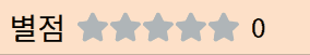
구현된 모습